ShopDreamUp AI ArtDreamUp
Deviation Actions


Suggested Deviants


Suggested Collections


You Might Like…


Description
Hi there wanted to show how I develop designs... I still have to find my sketches for the inital stages of the logo.
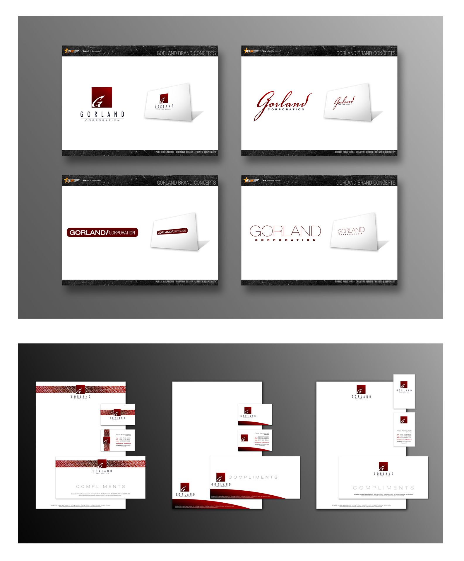
You'll prob recognise the branding on the concept sheets from the work I did for a company called ITSPR... their identity is in my gallery. This is part of a pitch I designed for them (using me as the designer they would use)
The Gorland Corporation are a london based designer fashion retailer. The brief was to produce a look that exuded all the qualities of a top fashion house. We were told that it had to look classy, luxurious, basically all the usual you'd expect... as the brief was quite open, I decided that we should go woth presenting 4 options all relying on different design criteria. No1. Top left was designed so be able to have a logo as a singular brand identity that'd work well with or without the typography. No2. This is one of my favourites as it delves into a classical feel and uses a modern arrangment to bring it inline with modern design... No.3 This was the dark horse option, it was designed to be more of a tag that would represent the brand, but it is a lot more modern than anything I think they were after but I think it is good to cover a modern style if your client isn't sure... No.3 This was designed to be simple subtle and elegant. I researched fashion brands, perfumes, designers etc and I felt this was a nice balance between modern, classic, and elegant design ... the only thing would be is that it isn't all that unique but then again once it has been positioned in the market it would become a trademark of the company and be very timeless.
My favourites were 2 & 4... so they chose 1 (Wink)") ... shame ... but anyway the client is always right and unfortunately I wasn't there to pitch them, it was the Director of ITSPR... I would've sold mine no problem, lot more interesting working on something that inspires you I find.. but anyway, its not our job to reason why, its our job to do and design... so on to the stationary.
... shame ... but anyway the client is always right and unfortunately I wasn't there to pitch them, it was the Director of ITSPR... I would've sold mine no problem, lot more interesting working on something that inspires you I find.. but anyway, its not our job to reason why, its our job to do and design... so on to the stationary.
I was asked to create 3 separate styles using the logo I designed plus using a style of typography they had pre-selected from a sheet of choices I gave them, again if I can find it i'll post it. So here are the 3 choices I have created for them, i'll update as soon as I get any feedback... I have to say I prefer the simple clean one on the right.
You'll prob recognise the branding on the concept sheets from the work I did for a company called ITSPR... their identity is in my gallery. This is part of a pitch I designed for them (using me as the designer they would use)
The Gorland Corporation are a london based designer fashion retailer. The brief was to produce a look that exuded all the qualities of a top fashion house. We were told that it had to look classy, luxurious, basically all the usual you'd expect... as the brief was quite open, I decided that we should go woth presenting 4 options all relying on different design criteria. No1. Top left was designed so be able to have a logo as a singular brand identity that'd work well with or without the typography. No2. This is one of my favourites as it delves into a classical feel and uses a modern arrangment to bring it inline with modern design... No.3 This was the dark horse option, it was designed to be more of a tag that would represent the brand, but it is a lot more modern than anything I think they were after but I think it is good to cover a modern style if your client isn't sure... No.3 This was designed to be simple subtle and elegant. I researched fashion brands, perfumes, designers etc and I felt this was a nice balance between modern, classic, and elegant design ... the only thing would be is that it isn't all that unique but then again once it has been positioned in the market it would become a trademark of the company and be very timeless.
My favourites were 2 & 4... so they chose 1
I was asked to create 3 separate styles using the logo I designed plus using a style of typography they had pre-selected from a sheet of choices I gave them, again if I can find it i'll post it. So here are the 3 choices I have created for them, i'll update as soon as I get any feedback... I have to say I prefer the simple clean one on the right.
Image size
1585x1914px 486.43 KB
© 2006 - 2024 Diversionary
Comments7
Join the community to add your comment. Already a deviant? Log In
figures - a client usually always chooses the most boring one.
that's why if YOU don't like the design, dont even show it to them
nice job. 3 was my fav.
that's why if YOU don't like the design, dont even show it to them
nice job. 3 was my fav.